Using stroke method, how to create gradient line with sharp end in flutter? I want to draw the line as below in flutter.
Use CustomPainter to draw:
import 'package:flutter/material.dart';
void main() => runApp(Example());
class Example extends StatefulWidget {
#override
_ExampleState createState() => _ExampleState();
}
class _ExampleState extends State<Example> {
#override
void initState() {
super.initState();
}
#override
Widget build(BuildContext context) {
return MaterialApp(
home: Scaffold(
body: Center(
child: CustomPaint(
size: Size(200, 5),
painter: CurvePainter(),
),
)));
}
#override
void dispose() {
super.dispose();
}
}
class CurvePainter extends CustomPainter {
#override
void paint(Canvas canvas, Size size) {
var paint = Paint();
paint.color = Colors.black;
paint.style = PaintingStyle.fill; // Change this to fill
var path = Path();
path.moveTo(0, 0);
path.quadraticBezierTo(size.width / 2, size.height / 2, size.width, 0);
path.quadraticBezierTo(size.width / 2, -size.height / 2, 0, 0);
canvas.drawPath(path, paint);
}
#override
bool shouldRepaint(CustomPainter oldDelegate) {
return true;
}
}
modified sleepingkit answer:
import 'package:flutter/material.dart';
class PointedLinePainter extends CustomPainter {
final double width;
PointedLinePainter(this.width);
#override
void paint(Canvas canvas, Size size) {
var paint = Paint();
paint.color = Colors.white;
paint.style = PaintingStyle.fill;
var path = Path();
path.moveTo(0, 0);
path.quadraticBezierTo(width / 3, 0.5, width, 0);
path.quadraticBezierTo(width / 3, -0.5, 0, 0);
canvas.drawPath(path, paint);
}
#override
bool shouldRepaint(CustomPainter oldDelegate) {
return true;
}
}
somewhere in code:
Container(
margin: EdgeInsets.symmetric(horizontal: 10.0),
alignment: Alignment.centerLeft,
width: MediaQuery.of(context).size.width,
height: 2,
child: CustomPaint(
painter:
PointedLinePainter(width - 2 * horizontalPointedLineMargin),
),
)
Can't see your picture.You can use the CustomPaint widget to draw lines, define a class that extends CustomPainter, and use the canvas.drawLine() method.
Divider class
A thin horizontal line, with padding on either side.
In the material design language, this represents a divider. Dividers can be used in lists, Drawers, and elsewhere to separate content.
To create a divider between ListTile items, consider using ListTile.divideTiles, which is optimized for this case.
The box's total height is controlled by height. The appropriate padding is automatically computed from the height.
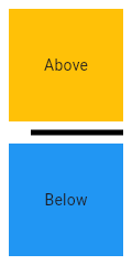
[
import 'package:flutter/material.dart';
void main() => runApp(MyApp());
/// This Widget is the main application widget.
class MyApp extends StatelessWidget {
static const String _title = 'Flutter Code Sample';
#override
Widget build(BuildContext context) {
return MaterialApp(
title: _title,
home: Scaffold(
appBar: AppBar(title: const Text(_title)),
body: MyStatelessWidget(),
),
);
}
}
/// This is the stateless widget that the main application instantiates.
class MyStatelessWidget extends StatelessWidget {
MyStatelessWidget({Key key}) : super(key: key);
#override
Widget build(BuildContext context) {
return Center(
child: Column(
children: <Widget>\[
Expanded(
child: Container(
color: Colors.amber,
child: const Center(
child: Text('Above'),
),
),
),
const Divider(
color: Colors.black,
height: 20,
thickness: 5,
indent: 20,
endIndent: 0,
),
Expanded(
child: Container(
color: Colors.blue,
child: const Center(
child: Text('Below'),
),
),
),
\],
),
);
}
}]
Here info how to change style enter link description here
Row(
children: [
Expanded(
child: SizedBox(
height: 3,
child: Container(
decoration: BoxDecoration(
gradient: LinearGradient(
colors: [Colors.white, Colors.black],
begin: Alignment.centerRight,
end: Alignment.centerLeft
)
),
),
),
),
Expanded(
child: SizedBox(
height: 3,
child: Container(
decoration: BoxDecoration(
gradient: LinearGradient(
colors: [Colors.white, Colors.black],
begin: Alignment.centerLeft,
end: Alignment.centerRight
)
),
),
),
),
],
)
Related
Im trying to create a card or Container with borderRadius to change its top side shape like a plane Knob but i cannot make it im attaching a picture so please if any one know how to create this in flutter help me thanks
Shape:
You can play with CliPPath, change the control point value to make it perfect.
class Test extends StatefulWidget {
const Test({super.key});
#override
State<Test> createState() => _TestState();
}
class _TestState extends State<Test> {
#override
Widget build(BuildContext context) {
return Scaffold(
backgroundColor: Colors.green,
body: LayoutBuilder(
builder: (p0, constaints) {
final width = constaints.maxWidth;
final double viewWidth = width * .8;
return Center(
child: SingleChildScrollView(
child: SizedBox(
width: viewWidth,
child: Column(
crossAxisAlignment: CrossAxisAlignment.center,
children: [
//top Curve
ClipPath(
clipper: CurvePath(),
child: Container(
width: viewWidth,
height: viewWidth,
color: Colors.white,
),
),
Container(
width: viewWidth,
height: 1200,
color: Colors.white,
)
],
),
),
),
);
},
),
);
}
}
class CurvePath extends CustomClipper<Path> {
#override
Path getClip(Size size) {
return Path()
..moveTo(0, size.height)
..quadraticBezierTo(20, 0, size.width / 2, 0)
..quadraticBezierTo(size.width, 0, size.width, size.height)
..lineTo(0, size.height);
}
#override
bool shouldReclip(covariant CustomClipper<Path> oldClipper) {
return false;
}
}
Also shapeBorder may help.
I am trying to achieve a container that will have a progress indicator border, like in this image:
I've tried to achieve it using a container inside another container (1 container for the outside white border, and one container for the inside blue background with the icon), but I can't achieve the progress indicator effect.
Does anyone know how can I achieve this?
Thank you
If you don't want to use a CustomPainter you can try to achieve that with a Stack widget
You can see this example in DartPad
Use the value property on the second CircularProgressIndicator to update the value with setState or any other State Management technique you like
import 'package:flutter/material.dart';
const Color darkBlue = Color.fromARGB(255, 18, 32, 47);
void main() {
runApp(MyApp());
}
class MyApp extends StatelessWidget {
#override
Widget build(BuildContext context) {
return MaterialApp(
theme: ThemeData.dark().copyWith(
scaffoldBackgroundColor: darkBlue,
),
debugShowCheckedModeBanner: false,
home: Scaffold(
body: Center(
child: MyWidget(),
),
),
);
}
}
class MyWidget extends StatelessWidget {
#override
Widget build(BuildContext context) {
return Stack(
children: const [
CircleAvatar(
backgroundColor: Colors.white,
radius: 24,
child: Icon(Icons.check),
),
SizedBox(
width: 50,
height: 50,
child: CircularProgressIndicator(
color: Colors.grey,
value: 1,
),
),
SizedBox(
width: 50,
height: 50,
child: CircularProgressIndicator(
color: Colors.blue,
value: .3, // Change this value to update the progress
),
),
],
);
}
}
There is a widget called CircularProgressIndicator that seems to be exactly what you're after.
How to use it:
CircularProgressIndicator(
backgroundColor: Colors.white,
color: Colors.purple.withAlpha(100),
strokeWidth: 5,
value: value, //
),
backgroundColor: for the white background
color: for the purple overlay
strokeWidth: for the thickness that you want
value: the actual progress of the indicator
And to have the arrow on top just use a round white Container (use a BoxDecoration with shape: BoxShape.circle to make it a circle), and put the arrow on top of it using the Stack widget.
Hope this helps!
class ProgressPainter extends CustomPainter {
final double value;
double deg2rad(double deg) => deg * pi / 180;
ProgressPainter({
required this.value,
});
#override
void paint(Canvas canvas, Size size) {
Paint paint = Paint()..color = Colors.blueGrey;
final rect = Rect.fromCenter(
center: Offset(size.height / 2, size.width / 2),
width: size.width,
height: size.height);
canvas.drawArc(
rect,
deg2rad(-90),
deg2rad(
(value * 360) / 100, // % to degree
),
true,
paint);
}
#override
bool shouldRepaint(covariant CustomPainter oldDelegate) {
return false;
}
}
And use
CustomPaint(
painter: ProgressPainter(value: sliderVal),
child: const SizedBox(
height: 100,
width: 100,
child: Icon( // your inner widget
Icons.ac_unit,
size: 100,
),
),
),
Tested widget:
class _MyHomePageState extends State<MyHomePage> {
double sliderVal = 0;
#override
Widget build(BuildContext context) {
return Scaffold(
appBar: AppBar(title: Text(widget.title)),
body: Center(
child: Column(
children: [
CustomPaint(
painter: ProgressPainter(value: sliderVal),
child: const SizedBox(
height: 100,
width: 100,
child: Icon(
Icons.ac_unit,
size: 100,
),
),
),
Slider(
value: sliderVal,
min: 0,
max: 100,
onChanged: (value) {
setState(() {
sliderVal = value;
});
},
)
],
),
),
);
}
}
How to make a container having shape like the image shown below. 👇
width = 300 and height = 130
The Two semicircles should be aligned at centre of the height of container
Please click on "Card" to see image
You need to use custom clippers.
Here's an example on that,
class CardClipper extends CustomClipper<Path> {
#override
Path getClip(Size size) {
final Path path = Path();
path.lineTo(0.0, size.height / 2 - 4);
path.relativeArcToPoint(const Offset(0, 30),
radius: const Radius.circular(10.0), largeArc: true);
path.lineTo(0.0, size.height);
path.lineTo(size.width, size.height);
path.lineTo(size.width, size.height / 2 + 26);
path.arcToPoint(Offset(size.width, size.height / 2 - 4),
radius: const Radius.circular(10.0), clockwise: true);
path.lineTo(size.width, 0);
path.lineTo(0.0, 0.0);
return path;
}
#override
bool shouldReclip(CustomClipper<Path> oldClipper) => true;
}
Okay, that's about the clipper, we can now use it, but it won't provide us with shadow.
To cast shadows to clipper objects, we'll use Clip Shadow package.
Now, we'll implement CardClipper with actual Clip Widget, in this case, ClipShadow,
ClipShadow(
clipper: CardClipper(),
boxShadow: [
BoxShadow(
offset: Offset(0, 4),
blurRadius: 18,
color: Color.fromRGBO(0, 0, 0, 0.1)),
],
child: Card(...)
);
Try playing with values in the clipper until you get the desired output.
You can try with custom painter.
import 'package:flutter/material.dart';
import 'dart:math' as math;
void main() => runApp(MyApp());
class MyApp extends StatelessWidget {
#override
Widget build(BuildContext context) {
return MaterialApp(
debugShowCheckedModeBanner: false,
home: HomePage(),
);
}
}
class HomePage extends StatefulWidget {
#override
_HomePageState createState() => _HomePageState();
}
class _HomePageState extends State<HomePage> {
DateTime date = DateTime.now();
#override
void initState() {
super.initState();
}
#override
Widget build(BuildContext context) {
return Scaffold(
backgroundColor: Colors.white54,
body: SafeArea(
child: Container(
child: Center(
child: Container(
decoration: BoxDecoration(
color: Colors.green,
borderRadius: BorderRadius.circular(10)
),
height: 100,
width: 200,
child: Stack(
clipBehavior: Clip.antiAlias,
children: [
Positioned(
left: -15,
bottom: 35,
child: Container(
height: 30,
width: 30,
child: CustomPaint(
painter: MyPainter(),
),
)),
Positioned(
right: -15,
bottom: 30.5,
child: Container(
height: 30,
width: 35,
child: CustomPaint(
painter: MyPainter(),
),
),
)
],
)),
),
),
),
);
}
}
class MyPainter extends CustomPainter {
#override
void paint(Canvas canvas, Size size) {
Paint paint = Paint()..color = Colors.white;
canvas.drawArc(
Rect.fromCenter(
center: Offset(size.height / 2, size.width / 2),
height: size.height,
width: size.width,
),
math.pi * 2,
math.pi * 2,
true,
paint,
);
}
#override
bool shouldRepaint(CustomPainter oldDelegate) => false;
}
output:
N.B: Adjust your color and circle height and width as you need
I want to draw multiple rectangles like this
I have used CustomPainter to get desired result but getting something different.
I have shared the code and undesired output image below,
Please help me to draw the overlapped ractangles with some positioning to get desired output.
import 'package:flutter/material.dart';
class SplashScreen extends StatelessWidget {
#override
Widget build(BuildContext context) {
double _width = MediaQuery.of(context).size.width;
// double _height = MediaQuery.of(context).size.height;
return Scaffold(
body: Container(
width: _width,
// height: _height,
child: Center(
child: Stack(children: <Widget>[
CustomPaint(
painter: DrawCustomRect(0, 0, 80, 112, 0xFFFA2A2A),
),
CustomPaint(
painter: DrawCustomRect(0, 0, 16, 96, 0xFFFF5454),
),
CustomPaint(
// DrawCustomRect(_left,_top,_right, _bottom, _color);
painter: DrawCustomRect(0, 0, 16, 80, 0xFFFF8D8D),
),
]),
),
),
);
}
}
class DrawCustomRect extends CustomPainter {
final double _left;
final double _top;
final double _right; //width
final double _bottom; //height
final int _color;
DrawCustomRect(this._left, this._top, this._right, this._bottom, this._color);
#override
void paint(Canvas canvas, Size size) {
canvas.drawRect(
new Rect.fromLTRB(this._left, this._top, this._right, _bottom),
new Paint()..color = new Color(_color),
);
}
#override
bool shouldRepaint(DrawCustomRect oldDelegate) {
return false;
}
}
You can achieve this result using Containers inside a Stack:
Center(
child: Stack(
alignment: Alignment.center,
children: <Widget>[
Container(
margin: EdgeInsets.only(left: 300),
width: 75,
height: 100,
color: Colors.red[300],
),
Container(
margin: EdgeInsets.only(left: 150),
width: 150,
height: 200,
color: Colors.red[600],
),
Container(
width: 225,
height: 300,
color: Colors.red[900],
),
],
),
),
And then adjust the sizes and colors based on what you want.
The result:
There are two approaches to it. The first and easy one is to use a combination of stack and container widget to achieve the above effect. Here's the code I used
import 'package:flutter/material.dart';
void main() => runApp(MyApp());
class MyApp extends StatelessWidget {
#override
Widget build(BuildContext context) {
return MaterialApp(
title: 'Flutter Demo',
theme: ThemeData(
primarySwatch: Colors.blue,
),
home: MyHomePage(title: 'Flutter Demo Home Page'),
);
}
}
class MyHomePage extends StatefulWidget {
MyHomePage({Key key, this.title}) : super(key: key);
final String title;
#override
_MyHomePageState createState() => _MyHomePageState();
}
class _MyHomePageState extends State<MyHomePage> {
#override
Widget build(BuildContext context) {
return Scaffold(
body: Center(
child: Stack(
children: <Widget>[
Align(
alignment: Alignment(0.4, 0.1),
child: Container(
width: 60,
height: 60,
color: Colors.red[200],
),
),
Align(
alignment: Alignment(0.3, 0.1),
child: Container(
width: 70,
height: 70,
color: Colors.red[300],
),
),
Align(
alignment: Alignment(0.2, 0.1),
child: Container(
width: 80,
height: 80,
color: Colors.red[400],
),
),
Align(
alignment: Alignment(0.1, 0.1),
child: Container(
width: 90,
height: 90,
color: Colors.red[500],
),
),
],
),
),
);
}
}
The other one is by using the custom painter. You just have to fix some positioning in your code.
import 'package:flutter/material.dart';
void main() => runApp(MyApp());
class MyApp extends StatelessWidget {
#override
Widget build(BuildContext context) {
return MaterialApp(
title: 'Flutter Demo',
theme: ThemeData(
primarySwatch: Colors.blue,
),
home: SplashScreen(),
);
}
}
class SplashScreen extends StatelessWidget {
#override
Widget build(BuildContext context) {
double _width = MediaQuery.of(context).size.width;
// double _height = MediaQuery.of(context).size.height;
return Scaffold(
body: Container(
width: _width,
// height: _height,
child: Center(
child: Stack(
alignment: Alignment.center,
children: <Widget>[
CustomPaint(
painter: DrawCustomRect(112, 32, 0, 80, 0xFFFF8D8D),
),
CustomPaint(
painter: DrawCustomRect(96, 16, 0, 96, 0xFFFF5454),
),
CustomPaint(
painter: DrawCustomRect(80, 0, 0, 112, 0xFFFA2A2A),
),
],
),
),
),
);
}
}
class DrawCustomRect extends CustomPainter {
final double _left;
final double _top;
final double _right; //width
final double _bottom; //height
final int _color;
DrawCustomRect(this._left, this._top, this._right, this._bottom, this._color);
#override
void paint(Canvas canvas, Size size) {
canvas.drawRect(
new Rect.fromLTRB(this._left, this._top, this._right, _bottom),
new Paint()..color = new Color(_color),
);
}
#override
bool shouldRepaint(DrawCustomRect oldDelegate) {
return false;
}
}
i want to made container with two different opacity to make the screen more focus on some image, i used stack and container, is it possible to make something like this?
Here is my code example,
Stack(
children: <Widget>[
Image(),
Container(
height: double.infinity,
width: double.infinity,
color: Colors.black.withOpacity(0.4),
),
Thanks before guys,
I am not sure this is good solution. It will do the trick.
import 'package:flutter/material.dart';
void main() => runApp(MaterialApp(home: FirstPage()));
class FirstPage extends StatelessWidget {
#override
Widget build(BuildContext context) {
return Scaffold(
appBar: AppBar(title: Text("Demo")),
body: Stack(
fit: StackFit.expand,
children: <Widget>[
Image.network(
"https://images.pexels.com/photos/414612/pexels-photo-414612.jpeg",
fit: BoxFit.cover,
),
CustomPaint(
painter: MyPainter(),
)
],
),
);
}
}
class MyPainter extends CustomPainter {
final Color color;
final double opacity;
///ratio of max(height, width)
final double radius;
MyPainter({
Color color,
double radius = 0.3,
this.opacity = 0.4,
}) : assert(opacity != null && opacity >= 0.0 && opacity <= 1.0),
color = color ?? Colors.black,
radius = radius ?? 0.3;
#override
void paint(Canvas canvas, Size size) {
var rect = Offset.zero & size;
var gradient = RadialGradient(
center: Alignment.center,
radius: radius,
colors: [const Color(0x0000000), color.withOpacity(opacity)],
stops: [1.0, 1.0],
);
canvas.drawRect(
rect,
Paint()..shader = gradient.createShader(rect),
);
}
#override
bool shouldRepaint(CustomPainter oldDelegate) {
return false;
}
}