Related
How to make a container having shape like the image shown below. 👇
width = 300 and height = 130
The Two semicircles should be aligned at centre of the height of container
Please click on "Card" to see image
You need to use custom clippers.
Here's an example on that,
class CardClipper extends CustomClipper<Path> {
#override
Path getClip(Size size) {
final Path path = Path();
path.lineTo(0.0, size.height / 2 - 4);
path.relativeArcToPoint(const Offset(0, 30),
radius: const Radius.circular(10.0), largeArc: true);
path.lineTo(0.0, size.height);
path.lineTo(size.width, size.height);
path.lineTo(size.width, size.height / 2 + 26);
path.arcToPoint(Offset(size.width, size.height / 2 - 4),
radius: const Radius.circular(10.0), clockwise: true);
path.lineTo(size.width, 0);
path.lineTo(0.0, 0.0);
return path;
}
#override
bool shouldReclip(CustomClipper<Path> oldClipper) => true;
}
Okay, that's about the clipper, we can now use it, but it won't provide us with shadow.
To cast shadows to clipper objects, we'll use Clip Shadow package.
Now, we'll implement CardClipper with actual Clip Widget, in this case, ClipShadow,
ClipShadow(
clipper: CardClipper(),
boxShadow: [
BoxShadow(
offset: Offset(0, 4),
blurRadius: 18,
color: Color.fromRGBO(0, 0, 0, 0.1)),
],
child: Card(...)
);
Try playing with values in the clipper until you get the desired output.
You can try with custom painter.
import 'package:flutter/material.dart';
import 'dart:math' as math;
void main() => runApp(MyApp());
class MyApp extends StatelessWidget {
#override
Widget build(BuildContext context) {
return MaterialApp(
debugShowCheckedModeBanner: false,
home: HomePage(),
);
}
}
class HomePage extends StatefulWidget {
#override
_HomePageState createState() => _HomePageState();
}
class _HomePageState extends State<HomePage> {
DateTime date = DateTime.now();
#override
void initState() {
super.initState();
}
#override
Widget build(BuildContext context) {
return Scaffold(
backgroundColor: Colors.white54,
body: SafeArea(
child: Container(
child: Center(
child: Container(
decoration: BoxDecoration(
color: Colors.green,
borderRadius: BorderRadius.circular(10)
),
height: 100,
width: 200,
child: Stack(
clipBehavior: Clip.antiAlias,
children: [
Positioned(
left: -15,
bottom: 35,
child: Container(
height: 30,
width: 30,
child: CustomPaint(
painter: MyPainter(),
),
)),
Positioned(
right: -15,
bottom: 30.5,
child: Container(
height: 30,
width: 35,
child: CustomPaint(
painter: MyPainter(),
),
),
)
],
)),
),
),
),
);
}
}
class MyPainter extends CustomPainter {
#override
void paint(Canvas canvas, Size size) {
Paint paint = Paint()..color = Colors.white;
canvas.drawArc(
Rect.fromCenter(
center: Offset(size.height / 2, size.width / 2),
height: size.height,
width: size.width,
),
math.pi * 2,
math.pi * 2,
true,
paint,
);
}
#override
bool shouldRepaint(CustomPainter oldDelegate) => false;
}
output:
N.B: Adjust your color and circle height and width as you need
so here's the deal. I created (sort of) a custom clipper shaped like a wave inside a class called WaveClipper
the wave clipper class:
class WaveClipper extends CustomClipper<Path> {
#override
Path getClip(Size size) {
var path = Path();
path.lineTo(0, 220);
path.quadraticBezierTo(size.width / 4, 160 , size.width / 2, 175);
path.quadraticBezierTo(3 / 4 * size.width, 190, size.width, 130);
path.lineTo(size.width, 0);
path.close();
return path;
}
#override
bool shouldReclip(CustomClipper<Path> oldClipper) {
return false;
}
}
And whenever I display it using a scaffold it shows fine however when I try to push it inside a SliverListView which is inside a CustomScrollView then nothing appears and there are no errors either. Is the clipper under the content? And how can I display it.
the clipper I am trying to show:
Stack(
children: [
ClipPath(
clipper: WaveClipper(),
child: Container(
color: Colors.cyanAccent,
))
],
),
where I am trying to show it:
Scaffold(
appBar: AppBar(
backgroundColor: Colors.white,
elevation: 0.0,
iconTheme: IconThemeData(
color: Colors.cyanAccent,
),
),
backgroundColor: Colors.white,
body: CustomScrollView(
physics: const BouncingScrollPhysics(),
slivers: [
SliverList(
delegate: SliverChildListDelegate([
//here
//there rest of the content (mostly buttons)
]),
),
],
),
)
Any help is appreciated and thank you for taking the time.
Try to give some dimension to your Container:
Stack(
children: [
ClipPath(
clipper: WaveClipper(),
child: Container(
height: 300,
color: Colors.amber.shade200,
),
),
],
),
Full source code
import 'package:flutter/material.dart';
void main() {
runApp(
MaterialApp(
debugShowCheckedModeBanner: false,
title: 'Flutter Demo',
home: HomePage(),
),
);
}
class HomePage extends StatelessWidget {
#override
Widget build(BuildContext context) {
return Scaffold(
appBar: AppBar(
backgroundColor: Colors.white,
elevation: 0.0,
iconTheme: IconThemeData(
color: Colors.cyanAccent,
),
),
backgroundColor: Colors.white,
body: CustomScrollView(
physics: const BouncingScrollPhysics(),
slivers: [
SliverList(
delegate: SliverChildListDelegate([
Stack(
children: [
ClipPath(
clipper: WaveClipper(),
child: Container(
height: 300,
color: Colors.amber.shade200,
),
),
],
),
]),
),
],
),
);
}
}
class WaveClipper extends CustomClipper<Path> {
#override
Path getClip(Size size) {
var path = Path();
path.lineTo(0, 220);
path.quadraticBezierTo(size.width / 4, 160, size.width / 2, 175);
path.quadraticBezierTo(3 / 4 * size.width, 190, size.width, 130);
path.lineTo(size.width, 0);
path.close();
return path;
}
#override
bool shouldReclip(CustomClipper<Path> oldClipper) {
return false;
}
}
Container(
height: device.size.height * 0.3,
child: Scaffold(
body: Stack(
clipBehavior: Clip.none,
children: [
ClipPath(
clipper: WaveClipper(),
child: Container(
color: Colors.cyanAccent,
))
],
),
),
),
Wrap with a Scaffold and give that Scaffold a size using a Container, if anyone has a better solution by all means post it.
import 'package:flutter/material.dart';
class LoginScreen extends StatelessWidget {
#override
Widget build(BuildContext context) {
return Scaffold(
body: Container(
child: Stack(
children: [
Opacity(opacity: 0.5,
child: ClipPath(
clipper: WaveClipper(),
child: Container(color: Colors.red,
height: 200,),
),
),
ClipPath(
clipper: WaveClipper(),
child: Container(color: Colors.deepOrange,
height: 180,),
),
],
),
),
);
}
}
class WaveClipper extends CustomClipper<Path>{
#override
Path getClip(Size size){
debugPrint(size.width.toString());
var path = new Path();
path.lineTo(0,size.height);
var firstStart = Offset(size.width / 5,size.height);
var firstEnd = Offset(size.width / 2.25,size.height - 50);
path.quadraticBezierTo(firstStart.dx, firstStart.dy, firstEnd.dx, firstEnd.dy);
var secondStart = Offset(size.width -(size.width/3.24), size.height - 105);
var secondEnd = Offset(size.width, size.height - 10);
path.quadraticBezierTo(secondStart.dx, secondStart.dy, secondEnd.dx, secondEnd.dy);
path.lineTo(size.width, 0);
path.close();
return path;
}
#override
bool shouldReclip(CustomClipper<Path> oldClipper) {
return false;
}
}
Optionally add dotted_decoration package if needed:
https://pub.dev/packages/dotted_decoration
import 'package:flutter/material.dart';
import 'package:dotted_decoration/dotted_decoration.dart';
void main() {
runApp(MyApp());
}
class MyApp extends StatelessWidget {
#override
Widget build(BuildContext context) {
return MaterialApp(
home: HomePage(),
);
}
}
class HomePage extends StatelessWidget {
#override
Widget build(BuildContext context) {
return Scaffold(
body: Center(child: DiscountTile()),
);
}
}
class DiscountTile extends StatelessWidget {
#override
Widget build(BuildContext context) {
return ClipPath(
clipper: _DiscountTileClipper(),
child: Container(
clipBehavior: Clip.antiAlias,
decoration: const BoxDecoration(
borderRadius: BorderRadius.all(Radius.circular(16)),
),
child: ColoredBox(
color: Colors.blue,
child: Row(
children: [
SizedBox(width: 100),
Expanded(
child: DecoratedBox(
decoration: DottedDecoration(
linePosition: LinePosition.left,
color: Colors.red,
strokeWidth: 3,
),
child: Padding(
padding: EdgeInsets.all(8.0),
child: Text('hello world' * 20),
),
),
),
],
),
),
),
);
}
}
class _DiscountTileClipper extends CustomClipper<Path> {
#override
Path getClip(Size size) {
const Radius radius = Radius.circular(1);
const bool clockwise = false;
const double clipRadius = 20;
const double decreaseValueWidgetWidth = 100.0;
const double leftPadding = decreaseValueWidgetWidth + 9;
return Path()
..lineTo(leftPadding - clipRadius, 0)
..arcToPoint(
const Offset(leftPadding, 0),
clockwise: clockwise,
radius: radius,
)
..lineTo(size.width, 0)
..lineTo(size.width, size.height)
..lineTo(leftPadding, size.height)
..arcToPoint(
Offset(leftPadding - clipRadius, size.height),
clockwise: clockwise,
radius: radius,
)
..lineTo(0, size.height)
..close();
}
#override
bool shouldReclip(_DiscountTileClipper oldClipper) => true;
}
Using stroke method, how to create gradient line with sharp end in flutter? I want to draw the line as below in flutter.
Use CustomPainter to draw:
import 'package:flutter/material.dart';
void main() => runApp(Example());
class Example extends StatefulWidget {
#override
_ExampleState createState() => _ExampleState();
}
class _ExampleState extends State<Example> {
#override
void initState() {
super.initState();
}
#override
Widget build(BuildContext context) {
return MaterialApp(
home: Scaffold(
body: Center(
child: CustomPaint(
size: Size(200, 5),
painter: CurvePainter(),
),
)));
}
#override
void dispose() {
super.dispose();
}
}
class CurvePainter extends CustomPainter {
#override
void paint(Canvas canvas, Size size) {
var paint = Paint();
paint.color = Colors.black;
paint.style = PaintingStyle.fill; // Change this to fill
var path = Path();
path.moveTo(0, 0);
path.quadraticBezierTo(size.width / 2, size.height / 2, size.width, 0);
path.quadraticBezierTo(size.width / 2, -size.height / 2, 0, 0);
canvas.drawPath(path, paint);
}
#override
bool shouldRepaint(CustomPainter oldDelegate) {
return true;
}
}
modified sleepingkit answer:
import 'package:flutter/material.dart';
class PointedLinePainter extends CustomPainter {
final double width;
PointedLinePainter(this.width);
#override
void paint(Canvas canvas, Size size) {
var paint = Paint();
paint.color = Colors.white;
paint.style = PaintingStyle.fill;
var path = Path();
path.moveTo(0, 0);
path.quadraticBezierTo(width / 3, 0.5, width, 0);
path.quadraticBezierTo(width / 3, -0.5, 0, 0);
canvas.drawPath(path, paint);
}
#override
bool shouldRepaint(CustomPainter oldDelegate) {
return true;
}
}
somewhere in code:
Container(
margin: EdgeInsets.symmetric(horizontal: 10.0),
alignment: Alignment.centerLeft,
width: MediaQuery.of(context).size.width,
height: 2,
child: CustomPaint(
painter:
PointedLinePainter(width - 2 * horizontalPointedLineMargin),
),
)
Can't see your picture.You can use the CustomPaint widget to draw lines, define a class that extends CustomPainter, and use the canvas.drawLine() method.
Divider class
A thin horizontal line, with padding on either side.
In the material design language, this represents a divider. Dividers can be used in lists, Drawers, and elsewhere to separate content.
To create a divider between ListTile items, consider using ListTile.divideTiles, which is optimized for this case.
The box's total height is controlled by height. The appropriate padding is automatically computed from the height.
[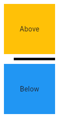
import 'package:flutter/material.dart';
void main() => runApp(MyApp());
/// This Widget is the main application widget.
class MyApp extends StatelessWidget {
static const String _title = 'Flutter Code Sample';
#override
Widget build(BuildContext context) {
return MaterialApp(
title: _title,
home: Scaffold(
appBar: AppBar(title: const Text(_title)),
body: MyStatelessWidget(),
),
);
}
}
/// This is the stateless widget that the main application instantiates.
class MyStatelessWidget extends StatelessWidget {
MyStatelessWidget({Key key}) : super(key: key);
#override
Widget build(BuildContext context) {
return Center(
child: Column(
children: <Widget>\[
Expanded(
child: Container(
color: Colors.amber,
child: const Center(
child: Text('Above'),
),
),
),
const Divider(
color: Colors.black,
height: 20,
thickness: 5,
indent: 20,
endIndent: 0,
),
Expanded(
child: Container(
color: Colors.blue,
child: const Center(
child: Text('Below'),
),
),
),
\],
),
);
}
}]
Here info how to change style enter link description here
Row(
children: [
Expanded(
child: SizedBox(
height: 3,
child: Container(
decoration: BoxDecoration(
gradient: LinearGradient(
colors: [Colors.white, Colors.black],
begin: Alignment.centerRight,
end: Alignment.centerLeft
)
),
),
),
),
Expanded(
child: SizedBox(
height: 3,
child: Container(
decoration: BoxDecoration(
gradient: LinearGradient(
colors: [Colors.white, Colors.black],
begin: Alignment.centerLeft,
end: Alignment.centerRight
)
),
),
),
),
],
)
I am creating a story app where two users telling the story like this in the below images. so here I want to create a dialog box like the below image. but I don't know how to create
You should be implement below way
class IntroPage extends StatefulWidget {
#override
State<StatefulWidget> createState() => _IntroPageState();
}
class _IntroPageState extends State<IntroPage>
with SingleTickerProviderStateMixin {
AnimationController animationController;
bool _menuShown = false;
#override
void initState() {
animationController =
AnimationController(vsync: this, duration: Duration(milliseconds: 500));
super.initState();
}
#override
Widget build(BuildContext context) {
Animation opacityAnimation =
Tween(begin: 0.0, end: 1.0).animate(animationController);
if (_menuShown)
animationController.forward();
else
animationController.reverse();
return Scaffold(
backgroundColor: Colors.amberAccent,
body: Stack(
overflow: Overflow.visible,
children: <Widget>[
Positioned(
right: 0,
top:90,
child: InkWell(
onTap: () {
setState(() {
_menuShown = !_menuShown;
});
},
child: Image.asset(
'assets/images/girls.png',
height: 250,
),
),
),
Positioned(
child: FadeTransition(
opacity: opacityAnimation,
child: _DialogUI(),
),
right: 40.0,
top: 300.0,
),
],
),
);
}
}
class _DialogUI extends StatelessWidget {
_DialogUI();
final double padding = 8.0;
#override
Widget build(BuildContext context) {
return Center(
child: Material(
clipBehavior: Clip.antiAlias,
shape: _DialogShapeBorder(
borderRadius: BorderRadius.all(Radius.circular(padding)),
padding: padding),
elevation: 4.0,
child: Container(
margin: const EdgeInsets.all(10),
padding: EdgeInsets.all(padding).copyWith(bottom: padding * 2),
child: Center(
child: Text(
'Filler text is text that shares \nsome characteristics of a real written text, \n but is random or otherwise generated.\n It may be used to display a sample of fonts,\n generate text for testing, or to spoof an e-mail spam filter.'),
),
)),
);
}
}
class _DialogShapeBorder extends RoundedRectangleBorder {
_DialogShapeBorder({
#required this.padding,
side = BorderSide.none,
borderRadius = BorderRadius.zero,
}) : super(side: side, borderRadius: borderRadius);
final double padding;
#override
Path getOuterPath(Rect rect, {TextDirection textDirection}) {
return Path()
..moveTo(rect.width - 18.0, rect.top)
..lineTo(rect.width - 20.0, rect.top - 36.0)
..lineTo(rect.width - 52.0, rect.top)
..addRRect(borderRadius.resolve(textDirection).toRRect(Rect.fromLTWH(
rect.left, rect.top, rect.width, rect.height - padding)));
}
}
Output
I want to create a widget where you can add multiple widgets with different sizes and can change their position by using the drag and drop technique. Something like a grid view with drag and drop where you can change the position both horizontally and vertically. While you are dragging the selected widget, other widgets will move around to open up space for it.
Does anyone have any suggestion where to start or are there already some examples that are implementing what I am looking for?
You can also try this easier one (It doesn't include Feedback)
class MyApp extends StatelessWidget {
#override
Widget build(BuildContext context) {
return MaterialApp(home: Scaffold(body: HomePage()));
}
}
class HomePage extends StatefulWidget {
#override
_HomePageState createState() => _HomePageState();
}
class _HomePageState extends State<HomePage> {
Offset offset = Offset.zero;
#override
Widget build(BuildContext context) {
return Stack(
children: <Widget>[
Positioned(
left: offset.dx,
top: offset.dy,
child: GestureDetector(
onPanUpdate: (details) {
setState(() {
offset = Offset(offset.dx + details.delta.dx, offset.dy + details.delta.dy);
});
},
child: Container(width: 100, height: 100, color: Colors.blue),
),
),
],
);
}
}
Although this may not answer your question but people who are looking for simple drag and drop widget, then here is the example.
See my 2nd answer for more simpler way
class MyApp extends StatelessWidget {
#override
Widget build(BuildContext context) {
return MaterialApp(
home: Scaffold(
appBar: AppBar(
title: Text("Drag app"),
),
body: HomePage(),
),
);
}
}
class HomePage extends StatefulWidget {
#override
State<StatefulWidget> createState() {
return _HomePageState();
}
}
class _HomePageState extends State<HomePage> {
double width = 100.0, height = 100.0;
Offset position ;
#override
void initState() {
super.initState();
position = Offset(0.0, height - 20);
}
#override
Widget build(BuildContext context) {
return Stack(
children: <Widget>[
Positioned(
left: position.dx,
top: position.dy - height + 20,
child: Draggable(
child: Container(
width: width,
height: height,
color: Colors.blue,
child: Center(child: Text("Drag", style: Theme.of(context).textTheme.headline,),),
),
feedback: Container(
child: Center(
child: Text("Drag", style: Theme.of(context).textTheme.headline,),),
color: Colors.blue[300],
width: width,
height: height,
),
onDraggableCanceled: (Velocity velocity, Offset offset){
setState(() => position = offset);
},
),
),
],
);
}
}
I've created a package called reorderables that solved this problem. You just need to tell the package your function to be called when drag and drop is done onReorder(int oldIndex, int newIndex).
This example has 9 icon widgets in a grid -
Screenshot: ReorderableWrap
class _WrapExampleState extends State<WrapExample> {
final double _iconSize = 90;
List<Widget> _tiles;
#override
void initState() {
super.initState();
_tiles = <Widget>[
Icon(Icons.filter_1, key: ValueKey(1), size: _iconSize),
Icon(Icons.filter_2, key: ValueKey(2), size: _iconSize),
Icon(Icons.filter_3, key: ValueKey(3), size: _iconSize),
Icon(Icons.filter_4, key: ValueKey(4), size: _iconSize),
Icon(Icons.filter_5, key: ValueKey(5), size: _iconSize),
Icon(Icons.filter_6, key: ValueKey(6), size: _iconSize),
Icon(Icons.filter_7, key: ValueKey(7), size: _iconSize),
Icon(Icons.filter_8, key: ValueKey(8), size: _iconSize),
Icon(Icons.filter_9, key: ValueKey(9), size: _iconSize),
];
}
#override
Widget build(BuildContext context) {
void _onReorder(int oldIndex, int newIndex) {
setState(() {
Widget row = _tiles.removeAt(oldIndex);
_tiles.insert(newIndex, row);
});
}
return ReorderableWrap(
spacing: 8.0,
runSpacing: 4.0,
padding: const EdgeInsets.all(8),
children: _tiles,
onReorder: _onReorder
);
}
}
If you want to limit the number of columns, you can use an optional parameter named maxMainAxisCount
Here is example of draggable text
class DraggableText extends StatefulWidget {
final Offset initialOffset;
final String text;
DraggableText(this.text, this.initialOffset);
#override
_DraggableTextState createState() => new _DraggableTextState();
}
class _DraggableTextState extends State<DraggableText> {
Offset position = new Offset(0.0, 0.0);
#override
void initState() {
super.initState();
position = widget.initialOffset;
}
#override
Widget build(BuildContext context) {
final item = new LabelBox(size: new Size.square(100.0), label: widget.text);
final avatar = new LabelBox(
size: new Size.square(150.0), label: widget.text, opacity: 0.4);
final draggable = new Draggable(
data: widget.text,
feedback: avatar,
child: item,
childWhenDragging: new Opacity(opacity: 0.0, child: item),
onDraggableCanceled: (velocity, offset) {
print('_DragBoxState.build -> offset ${offset}');
setState(() => position = offset);
});
return new Positioned(
left: position.dx, top: position.dy, child: draggable);
}
}
You can check full example and a more advanced one here https://github.com/rxlabz/flutter_dropcity
I cannot write comments becaus of my reputation but I wanted to answer to this question from the comments of CopsOnRoad's answer:
I don't want show feedback view instead of that I want to drag
original view. Is it possible?
If someones looking for this too, you could use: childWhenDragging: Container().
You're still dragging the feedback but the original child will be hidden.
...
child: Draggable(
child: Container(
width: width,
height: height,
color: Colors.blue,
child: Center(child: Text("Drag", style: Theme.of(context).textTheme.headline,),),
),
feedback: Container(
child: Center(
child: Text("Drag", style: Theme.of(context).textTheme.headline,),),
color: Colors.blue[300],
width: width,
height: height,
),
childWhenDragging: Container(), // <-- so it looks like the original view is beeing dragged
onDraggableCanceled: (Velocity velocity, Offset offset){
setState(() => position = offset);
},
),
...
You can also make use of LongPressDraggable, for this you need to long press your widget and then only you can drag it.
Offset _offset = Offset.zero;
#override
Widget build(BuildContext context) {
return Scaffold(
appBar: AppBar(),
body: LayoutBuilder(
builder: (context, constraints) {
return Stack(
children: [
Positioned(
left: _offset.dx,
top: _offset.dy,
child: LongPressDraggable(
feedback: FlutterLogo(colors: Colors.orange, size: 100),
child: FlutterLogo(colors: Colors.green, size: 100),
onDragEnd: (details) {
setState(() {
final adjustment = MediaQuery.of(context).size.height - constraints.maxHeight;
_offset = Offset(details.offset.dx, details.offset.dy - adjustment);
});
},
),
),
],
);
},
),
);
}