Actually I tried to implement a Timer. The custom painter turned out pretty good. But when I tried to put the custom painter in a row or Column it overflows. The custom paint is only displayed when I explicitly define the height and width of the container. Now I need to add a Timer String in a row with the custom paint but it doesn't work. The height and width of the container take the full size of the screen not allowing any other widget to display.
#override
Widget build(BuildContext context) {
double height = MediaQuery.of(context).size.height;
double width = MediaQuery.of(context).size.width;
return Scaffold(
backgroundColor: Styles.primaryDarkBlue,
body: SafeArea(
child: Container(
height: height,
width: width,
child: Padding(
padding: const EdgeInsets.all(8.0),
child: CustomPaint(
painter: TimerBar(
animation: animation,
)),
),
),
));
}
Here is the full code.
import 'package:flutter/material.dart';
import 'package:focus7/styles.dart';
class Timer extends StatefulWidget {
#override
_TimerState createState() => _TimerState();
}
class _TimerState extends State<Timer> with SingleTickerProviderStateMixin {
AnimationController controller;
Animation animation;
String get timerString {
Duration duration = controller.duration * controller.value;
return "${duration.inMinutes}:${(duration.inSeconds % 60).toString().padLeft(2, "0")}";
}
#override
void initState() {
super.initState();
controller = AnimationController(vsync: this, duration: Duration(seconds: 7));
animation = Tween<double>(begin: 0.1, end: 1).animate(controller);
controller.forward();
}
#override
Widget build(BuildContext context) {
double height = MediaQuery.of(context).size.height;
double width = MediaQuery.of(context).size.width;
print(height);
return Scaffold(
backgroundColor: Styles.primaryDarkBlue,
body: SafeArea(
child: Container(
height: height,
width: width,
child: Padding(
padding: const EdgeInsets.all(8.0),
child: CustomPaint(
painter: TimerBar(
animation: animation,
)),
),
),
));
}
}
class TimerBar extends CustomPainter {
final Gradient gradient = Styles.primaryGradient;
final Color timerBarColor = Styles.primaryBlue;
final Animation animation;
TimerBar({this.animation}) : super(repaint: animation);
#override
void paint(Canvas canvas, Size size) {
Paint paint = new Paint()
..color = timerBarColor
..strokeCap = StrokeCap.round
..style = PaintingStyle.stroke
..strokeWidth = 5;
Rect rect = new Rect.fromLTWH(0, 0, size.width, size.height / 25);
RRect rrectBorder = new RRect.fromRectAndRadius(rect, Radius.circular(50));
canvas.drawRRect(rrectBorder, paint);
paint.style = PaintingStyle.fill;
paint.strokeWidth = 0;
paint.shader = gradient.createShader(rect);
Rect rectAnim = new Rect.fromLTWH(0, 0, size.width * animation.value, size.height / 25);
RRect rrect = new RRect.fromRectAndRadius(rectAnim, Radius.circular(50));
canvas.drawRRect(rrect, paint);
}
#override
bool shouldRepaint(CustomPainter oldDelegate) {
// TODO: implement shouldRepaint
return false;
}
}
here is the output:
when I tried to nest in a row:
return Scaffold(
backgroundColor: Styles.primaryDarkBlue,
body: SafeArea(
child: Row(
children: <Widget>[
Container(
height: height,
width: width,
child: Padding(
padding: const EdgeInsets.all(8.0),
child: CustomPaint(
painter: TimerBar(
animation: animation,
)),
),
),
AnimatedBuilder(animation: controller, builder: (context, child) {
return Text(timerString,style: TextStyle(fontSize:24 ),);
})
],
),
));
This can be done with an Expanded widget, and by passing the width and height explicitly to the Timer() class.
I created this dartpad with the code so that you could run it (I had to change some of the styling to make it work):
http://dartpad.dev/eb69452a5c577d1a8286c6dd1a56e331
First, the Expanded widget I used in the Scaffold:
return Scaffold(
backgroundColor: Colors.yellow,
body: SafeArea(
child: Row(
children: <Widget>[
Expanded( // <----------------------------------
child: Padding(
padding: const EdgeInsets.all(8.0),
child: CustomPaint(
painter: TimerBar(
width: width,
height: height,
animation: animation,
),
),
),
),
AnimatedBuilder(
animation: controller,
builder: (context, child) {
return Text(
timerString,
style: TextStyle(fontSize: 24),
);
},
)
],
),
),
);
This worked, but the height and width of the timer bar wasn't sized according to the mediaquery, so I made explicit variables to pass into the class:
class TimerBar extends CustomPainter {
final Gradient gradient = LinearGradient(
begin: Alignment.topRight,
end: Alignment.bottomLeft,
colors: [Colors.blue, Colors.red]);
final Color timerBarColor = Colors.blue;
final Animation animation;
final width; // <----------------------------------
final height; // <----------------------------------
TimerBar({this.animation, this.width, this.height}) // <----------------
: super(repaint: animation);
...
and then I used those widths for your two rectangle objects:
Rect rect = new Rect.fromLTWH(0, 0, width, height / 25); // <-------------
RRect rrectBorder = new RRect.fromRectAndRadius(rect, Radius.circular(50));
canvas.drawRRect(rrectBorder, paint);
paint.style = PaintingStyle.fill;
paint.strokeWidth = 0;
paint.shader = gradient.createShader(rect);
Rect rectAnim =
new Rect.fromLTWH(0, 0, width * animation.value, height / 25); // <------------
RRect rrect = new RRect.fromRectAndRadius(rectAnim, Radius.circular(50));
I have found a solution after many trial and errors....The below code looks fine.
return Scaffold(
backgroundColor: Styles.primaryDarkBlue,
body: SafeArea(
child: Padding(
padding: const EdgeInsets.all(10),
child: Row(
crossAxisAlignment: CrossAxisAlignment.start,
children: <Widget>[
Expanded(
flex: 5,
child: Padding(
padding: const EdgeInsets.all(8.0),
child: AnimatedBuilder(
animation: controller,
builder: (context, child) {
return CustomPaint(painter: TimerBar(animation: animation, height: height));
}),
),
),
Expanded(
flex: 1,
child: Padding(
padding: const EdgeInsets.all(8.0),
child: AnimatedBuilder(
animation: controller,
builder: (context, child) {
return Text(
timerString,
style: TextStyle(fontSize: 24, color: Styles.primaryWhite),
);
}),
),
)
],
),
),
));
output:
Related
This is what it shows in terminal
59:48: Error: The method 'CustomTimerPainter' isn't defined for the
class '_CountDownTimerState'.
'_CountDownTimerState' is from 'package:braintrinig/pages/Countdown_timer.dart'
('lib/pages/Countdown_timer.dart'). Try correcting the name to the
name of an existing method, or defining a method named
'CustomTimerPainter'.
painter: CustomTimerPainter(
How to solve this issue?
This is my code:
import 'package:flutter/material.dart';
import 'package:flutter/cupertino.dart';
class CountDownTimer extends StatefulWidget {
#override
_CountDownTimerState createState() => _CountDownTimerState();
}
class _CountDownTimerState extends State<CountDownTimer>
with TickerProviderStateMixin {
late AnimationController controller;
String get timerString {
Duration duration = controller.duration! * controller.value;
return '${duration.inMinutes}:${(duration.inSeconds % 60).toString().padLeft(2, '0')}';
}
#override
void initState() {
super.initState();
controller = AnimationController(
vsync: this,
duration: Duration(seconds: 5),
);
}
#override
Widget build(BuildContext context) {
ThemeData themeData = Theme.of(context);
return Scaffold(
backgroundColor: Colors.white10,
body:
Container(
color: Colors.amber,
height: controller.value * MediaQuery.of(context).size.height,
child: AnimatedBuilder(
animation: controller,
builder: (context, child) {
return Stack(
children: <Widget>[
Align(
alignment: Alignment.bottomCenter,
child: Container(
color: Colors.amber,
height:
controller.value * MediaQuery.of(context).size.height,
),
),
Padding(
padding: EdgeInsets.all(8.0),
child: Column(
mainAxisAlignment: MainAxisAlignment.spaceBetween,
children: <Widget>[
Expanded(
child: Align(
alignment: FractionalOffset.center,
child: AspectRatio(
aspectRatio: 1.0,
child: Stack(
children: <Widget>[
Positioned.fill(
child: CustomPaint(
painter: CustomTimerPainter(
animation: controller,
backgroundColor: Colors.white,
color: themeData.indicatorColor,
)),
),
Align(
alignment: FractionalOffset.center,
child: Column(
mainAxisAlignment:
MainAxisAlignment.spaceEvenly,
crossAxisAlignment:
CrossAxisAlignment.center,
children: <Widget>[
Text(
"Count Down Timer",
style: TextStyle(
fontSize: 20.0,
color: Colors.white),
),
Text(
timerString,
style: TextStyle(
fontSize: 112.0,
color: Colors.white),
),
],
),
),
],
),
),
),
),
AnimatedBuilder(
animation: controller,
builder: (context, child) {
return FloatingActionButton.extended(
onPressed: () {
if (controller.isAnimating)
controller.stop();
else {
controller.reverse(
from: controller.value == 0.0
? 1.0
: controller.value);
}
},
icon: Icon(controller.isAnimating
? Icons.pause
: Icons.play_arrow),
label: Text(
controller.isAnimating ? "Pause" : "Play"));
}),
],
),
),
],
);
}),
),
);
}
}
It checked that "CustomTimerPainter" is from circular_countdown_timer library.
After you add this library, the problem you mentioned will be resolved.
I pasted your code to my project and install "circular_countdown_timer", I didn't see any error right now.
circular_countdown_timer pub.dev
Add circular_countdown_timer in your pubspec.yaml => get => update.
dependencies:
circular_countdown_timer: ^0.2.2
Import this library into your dart file
import 'package:circular_countdown_timer/custom_timer_painter.dart';
The CustomeTimerPainter is a custom widget that someone has already written in your taken example,
You may please check those examples, or you can use the sample below.
class CustomTimerPainter extends CustomPainter {
CustomTimerPainter({
this.animation,
this.backgroundColor,
this.color,
}) : super(repaint: animation);
final Animation<double> animation;
final Color backgroundColor, color;
#override
void paint(Canvas canvas, Size size) {
Paint paint = Paint()
..color = backgroundColor
..strokeWidth = 10.0
..strokeCap = StrokeCap.butt
..style = PaintingStyle.stroke;
canvas.drawCircle(size.center(Offset.zero), size.width / 2.0, paint);
paint.color = color;
double progress = (1.0 - animation.value) * 2 * math.pi;
canvas.drawArc(Offset.zero & size, math.pi * 1.5, -progress, false, paint);
}
#override
bool shouldRepaint(CustomTimerPainter old) {
return animation.value != old.animation.value ||
color != old.color ||
backgroundColor != old.backgroundColor;
}
}
I try to add a prestart to a countdown, both have different duration. So i maked two animation A and B,
when i press the start button the animation A start and when it's finished the animation B begin.
What happen to me now, is they starts at the same time, i tried Interval class and Tween class and it didn't works.
My code at this moment looks like this :
import 'dart:math';
import 'package:flutter/material.dart';
import 'package:flutter/services.dart';
class Timer2 extends StatefulWidget {
#override
_Timer2State createState() => _Timer2State();
}
class _Timer2State extends State<Timer2> with TickerProviderStateMixin {
AnimationController animationController;
#override
void initState() {
super.initState();
animationController = AnimationController(vsync: this,duration: Duration(seconds: 10));
}
#override
Widget build(BuildContext context) {
return Scaffold(backgroundColor: Colors.black,
body: Padding(
padding: EdgeInsets.all(8.0),
child: AnimatedBuilder(
animation: animationController,
builder: (context, child){
return Stack(
children: [
Align(
alignment: Alignment.bottomCenter,
child: Container(
color: Colors.red,
height:
animationController.value * MediaQuery.of(context).size.height,
),
),
Column(
children: <Widget>[
Expanded(
child: Align(
alignment: FractionalOffset.center,
child: AspectRatio(
aspectRatio: 1.0,
child: Stack(
children: <Widget>[
Positioned.fill(
child: AnimatedBuilder(
animation: animationController,
builder: (BuildContext context, Widget child) {
return CustomPaint(
painter: TimerPainter(
animation: animationController,
backgroundColor: Colors.white,
color: Colors.pink),
);
},
),
),
],
),
),
),
),
Container(
margin: EdgeInsets.all(8.0),
child: Row(
mainAxisAlignment: MainAxisAlignment.center,
children: <Widget>[
FloatingActionButton(
child: AnimatedBuilder(
animation: animationController,
builder: (_, Widget child) {
return Icon(
animationController.isAnimating
? Icons.pause
: Icons.play_arrow
);
}),
backgroundColor: Colors.pinkAccent,
onPressed: () {
if (animationController.isAnimating ) {
animationController.stop();
} else {
animationController.reverse(
from: animationController.value == 0.0
? 1.0
: animationController.value);
};
setState(() {
Icon(animationController.isAnimating
? Icons.play_arrow
: Icons.pause
);
});
},
)
],
),
)
],
),
],
);
},
),
),
);
}
}
class TimerPainter extends CustomPainter {
final Animation<double> animation;
final Color backgroundColor;
final Color color;
TimerPainter({this.animation, this.backgroundColor, this.color})
: super(repaint: animation);
#override
void paint(Canvas canvas, Size size) {
paint = Paint()
..color = backgroundColor
..strokeWidth = 5.0
..strokeCap = StrokeCap.round
..style = PaintingStyle.stroke;
canvas.drawCircle(size.center(Offset.zero), size.width / 2.0, paint);
paint.color = color;
double progress = (1.0 - animation.value) * 2 * 3.14;
canvas.drawArc(Offset.zero & size, 3.14 * 1.5, - progress, false, paint);
}
#override
bool shouldRepaint(TimerPainter old) {
return animation.value != old.animation.value ||
color != old.color ||
backgroundColor != old.backgroundColor;
}
}
Thank you
Using stroke method, how to create gradient line with sharp end in flutter? I want to draw the line as below in flutter.
Use CustomPainter to draw:
import 'package:flutter/material.dart';
void main() => runApp(Example());
class Example extends StatefulWidget {
#override
_ExampleState createState() => _ExampleState();
}
class _ExampleState extends State<Example> {
#override
void initState() {
super.initState();
}
#override
Widget build(BuildContext context) {
return MaterialApp(
home: Scaffold(
body: Center(
child: CustomPaint(
size: Size(200, 5),
painter: CurvePainter(),
),
)));
}
#override
void dispose() {
super.dispose();
}
}
class CurvePainter extends CustomPainter {
#override
void paint(Canvas canvas, Size size) {
var paint = Paint();
paint.color = Colors.black;
paint.style = PaintingStyle.fill; // Change this to fill
var path = Path();
path.moveTo(0, 0);
path.quadraticBezierTo(size.width / 2, size.height / 2, size.width, 0);
path.quadraticBezierTo(size.width / 2, -size.height / 2, 0, 0);
canvas.drawPath(path, paint);
}
#override
bool shouldRepaint(CustomPainter oldDelegate) {
return true;
}
}
modified sleepingkit answer:
import 'package:flutter/material.dart';
class PointedLinePainter extends CustomPainter {
final double width;
PointedLinePainter(this.width);
#override
void paint(Canvas canvas, Size size) {
var paint = Paint();
paint.color = Colors.white;
paint.style = PaintingStyle.fill;
var path = Path();
path.moveTo(0, 0);
path.quadraticBezierTo(width / 3, 0.5, width, 0);
path.quadraticBezierTo(width / 3, -0.5, 0, 0);
canvas.drawPath(path, paint);
}
#override
bool shouldRepaint(CustomPainter oldDelegate) {
return true;
}
}
somewhere in code:
Container(
margin: EdgeInsets.symmetric(horizontal: 10.0),
alignment: Alignment.centerLeft,
width: MediaQuery.of(context).size.width,
height: 2,
child: CustomPaint(
painter:
PointedLinePainter(width - 2 * horizontalPointedLineMargin),
),
)
Can't see your picture.You can use the CustomPaint widget to draw lines, define a class that extends CustomPainter, and use the canvas.drawLine() method.
Divider class
A thin horizontal line, with padding on either side.
In the material design language, this represents a divider. Dividers can be used in lists, Drawers, and elsewhere to separate content.
To create a divider between ListTile items, consider using ListTile.divideTiles, which is optimized for this case.
The box's total height is controlled by height. The appropriate padding is automatically computed from the height.
[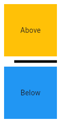
import 'package:flutter/material.dart';
void main() => runApp(MyApp());
/// This Widget is the main application widget.
class MyApp extends StatelessWidget {
static const String _title = 'Flutter Code Sample';
#override
Widget build(BuildContext context) {
return MaterialApp(
title: _title,
home: Scaffold(
appBar: AppBar(title: const Text(_title)),
body: MyStatelessWidget(),
),
);
}
}
/// This is the stateless widget that the main application instantiates.
class MyStatelessWidget extends StatelessWidget {
MyStatelessWidget({Key key}) : super(key: key);
#override
Widget build(BuildContext context) {
return Center(
child: Column(
children: <Widget>\[
Expanded(
child: Container(
color: Colors.amber,
child: const Center(
child: Text('Above'),
),
),
),
const Divider(
color: Colors.black,
height: 20,
thickness: 5,
indent: 20,
endIndent: 0,
),
Expanded(
child: Container(
color: Colors.blue,
child: const Center(
child: Text('Below'),
),
),
),
\],
),
);
}
}]
Here info how to change style enter link description here
Row(
children: [
Expanded(
child: SizedBox(
height: 3,
child: Container(
decoration: BoxDecoration(
gradient: LinearGradient(
colors: [Colors.white, Colors.black],
begin: Alignment.centerRight,
end: Alignment.centerLeft
)
),
),
),
),
Expanded(
child: SizedBox(
height: 3,
child: Container(
decoration: BoxDecoration(
gradient: LinearGradient(
colors: [Colors.white, Colors.black],
begin: Alignment.centerLeft,
end: Alignment.centerRight
)
),
),
),
),
],
)
I am creating a story app where two users telling the story like this in the below images. so here I want to create a dialog box like the below image. but I don't know how to create
You should be implement below way
class IntroPage extends StatefulWidget {
#override
State<StatefulWidget> createState() => _IntroPageState();
}
class _IntroPageState extends State<IntroPage>
with SingleTickerProviderStateMixin {
AnimationController animationController;
bool _menuShown = false;
#override
void initState() {
animationController =
AnimationController(vsync: this, duration: Duration(milliseconds: 500));
super.initState();
}
#override
Widget build(BuildContext context) {
Animation opacityAnimation =
Tween(begin: 0.0, end: 1.0).animate(animationController);
if (_menuShown)
animationController.forward();
else
animationController.reverse();
return Scaffold(
backgroundColor: Colors.amberAccent,
body: Stack(
overflow: Overflow.visible,
children: <Widget>[
Positioned(
right: 0,
top:90,
child: InkWell(
onTap: () {
setState(() {
_menuShown = !_menuShown;
});
},
child: Image.asset(
'assets/images/girls.png',
height: 250,
),
),
),
Positioned(
child: FadeTransition(
opacity: opacityAnimation,
child: _DialogUI(),
),
right: 40.0,
top: 300.0,
),
],
),
);
}
}
class _DialogUI extends StatelessWidget {
_DialogUI();
final double padding = 8.0;
#override
Widget build(BuildContext context) {
return Center(
child: Material(
clipBehavior: Clip.antiAlias,
shape: _DialogShapeBorder(
borderRadius: BorderRadius.all(Radius.circular(padding)),
padding: padding),
elevation: 4.0,
child: Container(
margin: const EdgeInsets.all(10),
padding: EdgeInsets.all(padding).copyWith(bottom: padding * 2),
child: Center(
child: Text(
'Filler text is text that shares \nsome characteristics of a real written text, \n but is random or otherwise generated.\n It may be used to display a sample of fonts,\n generate text for testing, or to spoof an e-mail spam filter.'),
),
)),
);
}
}
class _DialogShapeBorder extends RoundedRectangleBorder {
_DialogShapeBorder({
#required this.padding,
side = BorderSide.none,
borderRadius = BorderRadius.zero,
}) : super(side: side, borderRadius: borderRadius);
final double padding;
#override
Path getOuterPath(Rect rect, {TextDirection textDirection}) {
return Path()
..moveTo(rect.width - 18.0, rect.top)
..lineTo(rect.width - 20.0, rect.top - 36.0)
..lineTo(rect.width - 52.0, rect.top)
..addRRect(borderRadius.resolve(textDirection).toRRect(Rect.fromLTWH(
rect.left, rect.top, rect.width, rect.height - padding)));
}
}
Output
In Flutter you suppose I have a simple Container and I would like to change the size of that to up, for example in this simple screenshot I want to change top container in section 1 to up to have a top container in section 2
and top container in section 1 should behave only 100.0 after size to up
container B in section 1 and section 2 are in the same axis without change position when container A will be resized to up
for example, this is what I want to have
I'm not sure with which one animation I can have this feature
this code work, but this is not what I want to have.
i want to have draggable bottom sheet with changing border radius when bottom sheet arrived to top of screen like with pastes sample video screen and fade0n/out widget inside appbar which that inside top of bottom sheet, which that visible when bottom sheet arrived top or hide when bottom sheet don't have maximum size
import 'package:flutter/material.dart';
void main()=>runApp(SizeUp());
class SizeUp extends StatelessWidget {
#override
Widget build(BuildContext context) {
return MaterialApp(
title: 'test',
home: SizeUpAnim(),
);
}
}
class SizeUpAnim extends StatefulWidget {
#override
State<StatefulWidget> createState() =>_SizeUpAnim();
}
class _SizeUpAnim extends State with SingleTickerProviderStateMixin {
AnimationController _controller;
// ignore: constant_identifier_names
static const _PANEL_HEADER_HEIGHT = 32.0;
bool get _isPanelVisible {
final AnimationStatus status = _controller.status;
return status == AnimationStatus.completed ||
status == AnimationStatus.forward;
}
#override
void initState() {
super.initState();
_controller = AnimationController(
duration: const Duration(milliseconds: 100), value: 1.0, vsync: this);
}
#override
Widget build(BuildContext context) {
return Scaffold(
appBar: AppBar(
elevation: 8.0,
title: const Text("Step4"),
leading: IconButton(
onPressed: () {
_controller.fling(velocity: _isPanelVisible ? -1.0 : 1.0);
},
icon: AnimatedIcon(
icon: AnimatedIcons.close_menu,
progress: _controller.view,
),
),
),
body: Column(
children: <Widget>[
Expanded(
child: LayoutBuilder(
builder: _buildStack,
),
),
Text('aaa'),
],
),
);
}
Animation<RelativeRect> _getPanelAnimation(BoxConstraints constraints) {
final double height = constraints.biggest.height;
final double top = height - _PANEL_HEADER_HEIGHT;
const double bottom = -_PANEL_HEADER_HEIGHT;
return RelativeRectTween(
begin: RelativeRect.fromLTRB(0.0, top, 0.0, bottom),
end: const RelativeRect.fromLTRB(0.0, 0.0, 0.0, 0.0),
).animate( CurvedAnimation(parent: _controller, curve: Curves.linear));
}
Widget _buildStack(BuildContext context, BoxConstraints constraints) {
final Animation<RelativeRect> animation = _getPanelAnimation(constraints);
final ThemeData theme = Theme.of(context);
return Container(
color: theme.primaryColor,
child: Stack(
children: <Widget>[
const Center(
child: Text("base"),
),
PositionedTransition(
rect: animation,
child: Material(
borderRadius: const BorderRadius.only(
topLeft: Radius.circular(16.0),
topRight: Radius.circular(16.0)),
elevation: 12.0,
child: Container(
height: _PANEL_HEADER_HEIGHT,
child: const Center(child: Text("panel")),
),
),
),
],
),
);
}
#override
void dispose() {
super.dispose();
_controller.dispose();
}
}
import 'package:flutter/material.dart';
void main() => runApp(MyApp());
class MyApp extends StatelessWidget {
#override
Widget build(BuildContext context) {
return MaterialApp(
title: 'Flutter Demo',
theme: ThemeData(
primarySwatch: Colors.blue,
),
home: MyHomePage(),
);
}
}
class MyHomePage extends StatefulWidget {
#override
_MyHomePageState createState() => _MyHomePageState();
}
class _MyHomePageState extends State<MyHomePage> {
bool isLong = false;
#override
Widget build(BuildContext context) {
return Scaffold(
appBar: AppBar(
title: Text('First'),
),
body: Center(
child: Column(
crossAxisAlignment: CrossAxisAlignment.center,
mainAxisAlignment: MainAxisAlignment.center,
children: <Widget>[
Text('hey'),
RaisedButton(
onPressed: () {
setImages();
setState(() {
isLong = !isLong;
});
},
child: Text(isLong ? 'long' : 'short'),
),
RaisedButton(
onPressed: _onPressed,
child: Text('open'),
)
],
),
),
);
}
_onPressed() {
Navigator.of(context)
.push(TransparentRoute(builder: (context) => NewWidget(images)));
}
List<String> images = List.generate(
5,
(_) => 'http://placeimg.com/100/100/any',
);
void setImages() {
images = List.generate(
isLong ? 5 : 25,
(_) => 'http://placeimg.com/100/100/any',
);
}
}
class NewWidget extends StatefulWidget {
const NewWidget(this.images, {Key key}) : super(key: key);
final List<String> images;
#override
_NewWidgetState createState() => _NewWidgetState();
}
class _NewWidgetState extends State<NewWidget> {
bool isBig = false;
bool isStack = false;
bool isBounsing = true;
final double topOffset = 200;
final double miniHandleHeigh = 30;
double safeAreaPadding = 0;
double startBigAnimationOffset;
double startStickyOffset;
double backgroundHeight = 0;
double get savedAppBarHeigh => safeAreaPadding + kToolbarHeight;
final ScrollController controller = ScrollController();
#override
void initState() {
WidgetsBinding.instance.addPostFrameCallback(_afterLayout);
super.initState();
}
void _afterLayout(_) {
var media = MediaQuery.of(context);
safeAreaPadding = media.padding.top;
startBigAnimationOffset = topOffset - savedAppBarHeigh;
startStickyOffset = startBigAnimationOffset + 20;
backgroundHeight = media.size.height - miniHandleHeigh - topOffset;
var canScroll = !_isImageSizeBiggerThenBottomSheetSize(
media.size.width,
media.size.height,
);
controller.addListener(
canScroll ? withoutScrolling : withScrolling,
);
}
void withoutScrolling() {
var offset = controller.offset;
if (offset < 0) {
goOut();
} else {
controller.animateTo(
0,
duration: Duration(milliseconds: 100),
curve: Curves.easeIn,
);
}
}
void withScrolling() {
var offset = controller.offset;
if (offset < 0) {
goOut();
} else if (offset < startBigAnimationOffset && isBig) {
setState(() {
isBig = false;
});
} else if (offset > startBigAnimationOffset && !isBig) {
setState(() {
isBig = true;
});
} else if (offset > startStickyOffset && !isStack) {
setState(() {
isStack = true;
});
} else if (offset < startStickyOffset && isStack) {
setState(() {
isStack = false;
});
}
if (offset < topOffset && !isBounsing) {
setState(() => isBounsing = true);
} else if (offset > topOffset && isBounsing) {
setState(() => isBounsing = false);
}
}
void goOut() {
controller.dispose();
Navigator.of(context).pop();
}
_isImageSizeBiggerThenBottomSheetSize(
double screenWidth,
double screenHeight,
) {
// padding: 10, 3 in row;
print(screenHeight);
var itemHeight = (screenWidth - 20) / 3;
print(itemHeight);
var gridMaxHeight = screenHeight - topOffset - miniHandleHeigh;
print(gridMaxHeight);
return (widget.images.length / 3).floor() * itemHeight > gridMaxHeight;
}
#override
Widget build(BuildContext context) {
return Scaffold(
backgroundColor: isStack ? Colors.white : Colors.transparent,
body: Stack(
children: [
Positioned(
bottom: 0,
right: 0,
left: 0,
child: Container(
constraints: BoxConstraints(minHeight: backgroundHeight),
decoration: BoxDecoration(
color: Colors.white,
),
),
),
ListView(
physics:
isBounsing ? BouncingScrollPhysics() : ClampingScrollPhysics(),
controller: controller,
children: <Widget>[
Container(
alignment: Alignment.bottomCenter,
height: topOffset,
child: TweenAnimationBuilder(
tween: Tween(begin: 0.0, end: isBig ? 1.0 : 0.0),
duration: Duration(milliseconds: 500),
child: Align(
alignment: Alignment.topCenter,
child: Padding(
padding: EdgeInsets.only(top: 15),
child: Container(
decoration: BoxDecoration(
color: Colors.black38,
borderRadius: BorderRadius.circular(2),
),
height: 5,
width: 60,
),
),
),
builder: (_, number, child) {
return Container(
height: savedAppBarHeigh * number + miniHandleHeigh,
decoration: BoxDecoration(
borderRadius: BorderRadius.vertical(
top: Radius.circular((1 - number) * 20)),
color: Colors.white,
),
child: Opacity(opacity: 1 - number, child: child),
);
}),
),
Container(
padding: EdgeInsets.all(10),
constraints: BoxConstraints(
minHeight:
MediaQuery.of(context).size.height - savedAppBarHeigh),
decoration: BoxDecoration(
color: Colors.white,
),
child: getGrid(),
)
],
),
if (isStack)
_AppBar(
title: 'Gallery',
)
],
),
);
}
Widget getGrid() {
return GridView.count(
crossAxisSpacing: 10,
mainAxisSpacing: 10,
physics: NeverScrollableScrollPhysics(),
shrinkWrap: true,
crossAxisCount: 3,
children: widget.images.map((url) {
return Container(
decoration: BoxDecoration(
border: Border.all(
color: Colors.blueAccent,
),
),
child: Image(
image: NetworkImage(url),
),
);
}).toList(),
);
}
}
class _AppBar extends StatelessWidget {
const _AppBar({Key key, this.title}) : super(key: key);
final Color backgroundColor = Colors.white;
final Color color = Colors.grey;
final String title;
#override
Widget build(BuildContext context) {
return Material(
elevation: 5,
child: Container(
height: kToolbarHeight + MediaQuery.of(context).padding.top,
color: backgroundColor,
child: OverflowBox(
alignment: Alignment.topCenter,
maxHeight: 200,
child: SafeArea(
child: ConstrainedBox(
constraints: BoxConstraints(maxHeight: kToolbarHeight),
child: AppBar(
centerTitle: false,
backgroundColor: backgroundColor,
iconTheme: IconThemeData(
color: color, //change your color here
),
primary: false,
title: Text(
title,
style: TextStyle(color: color),
),
elevation: 0,
),
),
),
),
),
);
;
}
}
class TransparentRoute extends PageRoute<void> {
TransparentRoute({
#required this.builder,
RouteSettings settings,
}) : assert(builder != null),
super(settings: settings, fullscreenDialog: false);
final WidgetBuilder builder;
#override
bool get opaque => false;
#override
Color get barrierColor => null;
#override
String get barrierLabel => null;
#override
bool get maintainState => true;
#override
Duration get transitionDuration => Duration(milliseconds: 350);
#override
Widget buildPage(BuildContext context, Animation<double> animation,
Animation<double> secondaryAnimation) {
final result = builder(context);
return Container(
color: Colors.black.withOpacity(0.5),
child: SlideTransition(
position: Tween<Offset>(
begin: const Offset(0, 1),
end: Offset.zero,
).animate(CurvedAnimation(
parent: animation,
curve: Curves.easeIn,
)),
child: result,
),
);
}
}
I think you may try this library, sliding_sheet
when you detect the expand status by controller, then you animate/enlarge the container A.